Pandas#
hvPlot has been designed as a simple plotting interface (one-line call is enough for most cases) to many data libraries. It was greatly inspired by Pandas’ original plotting interface, that is mostly a convenient interface to Matplotlib’s plotting API, and allows in fact to pass many arguments directly to Matplotlib. On the other hand, hvPlot’s plotting interface is a convenient interface to HoloViews, that similarly allows to pass many arguments directly to HoloViews. Matplotlib and HoloViews are different types of visualization library, the former being a pure plotting tool (i.e. it knows how to draw pixels on your screen) while the later is more of a data exploration tool. These differences explain some of the differences you will observe between Pandas’ and hvPlot’s plotting APIs.
Pandas offers a mechanism to register a third-party plotting backend. When registered, <DataFrame|Series>.plot() calls are delegated to the third-party tool. hvPlot has implemented the required interface to be registered as Pandas’ plotting backend. As a consequence there are two main ways to generate hvPlot plots from Pandas objects:
By importing
hvplot.pandasand using the.hvplot()namespace (recommended).By registering hvPlot as Pandas’ plotting backend and using Pandas’
.plot()namespace.
Note
Pandas does not force third-party plotting tools like hvPlot to implement all of its plotting methods. It also does not enforce each method to implement specific arguments.
As a summary about hvPlot’s compatibility with Pandas’ plotting API:
hvPlot can be registered as Pandas plotting backend.
As an convenient interface to HoloViews and not to Matplotlib, hvPlot does not aim to be 100% compatible with Pandas’ API. However, Pandas users will find the plotting methods they are used to, and most of the generic arguments they accept. In a sense, hvPlot aims more for familiarity than compatibility.
For a more in-depth comparison between Pandas and hvPlot APIs, visit the Pandas API reference that recreates the Pandas chart visualization guide using both APIs.
%matplotlib inline
import hvplot.pandas  # noqa
import hvsampledata
import numpy as np
import pandas as pd

df = hvsampledata.penguins('pandas')
Switch Pandas backend to hvPlot#
Hint
This approach is an easy way (one-line change) to convert some code from generating plots with Pandas & Matplotlib to Pandas & hvPlot and see whether you like the output or not. Generally, we recommend installing the hvplot namespace on Pandas objects by importing hvplot.pandas, and invoking hvPlot via this namespace, e.g. df.hvplot.line(), as it can be adapted to other data libraries (e.g. if you use Dask, you can install the hvplot namespace on Dask objects with import hvplot.dask).
Note
This requires pandas >= 0.25.0.
hvPlot can be registered as Pandas’ plotting backend instead of Matplotlib with:
pd.options.plotting.backend = 'hvplot'
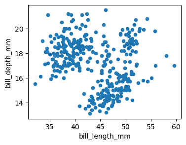
Once registered, hvPlot plots are generated when calling Pandas .plot():
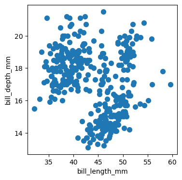
df.plot.scatter('bill_length_mm', 'bill_depth_mm')
Note
To function correctly hvPlot needs to load some front-end (Javascript, CSS, etc.) content in a notebook. This is usually achieved as a side-effect of importing for example hvplot.pandas. In the example above, this step is done in the first cell that calls .plot(). It is important not to delete this cell to avoid running into hard-to-debug interactivity issues.
API comparison#
Kind |
In Pandas |
In hvPlot |
Comment |
|---|---|---|---|
✅ |
✅ |
Alpha set to 0.5 automatically in Pandas when |
|
✅ |
✅ |
||
✅ |
✅ |
||
❌ |
✅ |
||
|
✅ |
✅ |
|
✅ |
✅ |
In Pandas |
|
|
✅ |
✅ |
|
❌ |
✅ |
Error bars can be set with |
|
❌ |
✅ |
||
✅ |
✅ |
|
|
✅ |
✅ |
Stacking not supported in hvPlot. hvPlot uses |
|
|
✅ |
✅ |
Pandas’ |
✅ |
✅ |
||
❌ |
✅ |
||
✅ |
✅ |
|
|
❌ |
✅ |
||
✅ |
✅ |
||
❌ |
✅ |
||
✅ |
✅ |
Pandas has a whole API dedicated to displaying and styling tables. It also offers |
|
|
✅ |
❌ |
Not yet implemented in HoloViews, see this issue |
❌ |
✅ |
For two independent variables, useful for geographic data for examples |
|
❌ |
✅ |
||
✅ |
✅ |
||
|
✅ |
❌ |
|
|
✅ |
❌ |
|
✅ |
✅ |
||
✅ |
✅ |
||
|
✅ |
❌ |
|
✅ |
✅ |
Notable differences#
pd.options.plotting.backend = 'matplotlib'
This section aims to describe a few of the main notable differences between Pandas and hvPlot plotting APIs. More specific differences can be found in the Pandas API page that recreates the Pandas chart visualization guide.
Figure handling#
A plot call in Pandas returns a Matplotlib Axes object. This object can be passed to Pandas’ plot API via the ax argument, for example to overlay two different plots. The ax argument is not supported in hvPlot.
plot = df.plot.scatter('bill_length_mm', 'bill_depth_mm', figsize=(4, 3))
print(plot)
Axes(0.125,0.11;0.775x0.77)
hvPlot’s plotting API returns HoloViews objects. These objects are wrappers around the original dataset, whose rich representation is a plot.
plot = df.hvplot.scatter('bill_length_mm', 'bill_depth_mm', hover_cols=['species'])
print(plot)
:Scatter [bill_length_mm] (bill_depth_mm,species)
plot
plot.data.head()
| species | island | bill_length_mm | bill_depth_mm | flipper_length_mm | body_mass_g | sex | year | |
|---|---|---|---|---|---|---|---|---|
| 0 | Adelie | Torgersen | 39.1 | 18.7 | 181.0 | 3750.0 | male | 2007 |
| 1 | Adelie | Torgersen | 39.5 | 17.4 | 186.0 | 3800.0 | female | 2007 |
| 2 | Adelie | Torgersen | 40.3 | 18.0 | 195.0 | 3250.0 | female | 2007 |
| 3 | Adelie | Torgersen | NaN | NaN | NaN | NaN | NaN | 2007 |
| 4 | Adelie | Torgersen | 36.7 | 19.3 | 193.0 | 3450.0 | female | 2007 |
Using HoloViews’ API, this object can be further customized.
import holoviews as hv

plot.opts(
    height=300, width=300, color=hv.dim('species'),
    cmap='Category10', show_legend=False,
).hist(['bill_length_mm','bill_depth_mm'])
Overlays and layouts#
In Pandas, overlays are usually created by passing down an Axes object to another plot call via the ax argument. Layouts are created by setting subplots=True, and can be customized further with the layout argument, or with Matplotlib’s API.
The approach is quite different in hvPlot as HoloViews offers some very convenient API with * for overlaying plots and + for laying out plots. Together with the subplots argument and HoloViews’ .cols(N) method to limit the number N of plots per row, this forms an API flexible enough to handle most situations.
df1 = df.query('species == "Adelie"')
df2 = df.query('species == "Gentoo"')
ax = df1.plot.scatter('bill_length_mm', 'bill_depth_mm', color="blue", label="Adelie")
df2.plot.scatter('bill_length_mm', 'bill_depth_mm', color="green", label="Gentoo", ax=ax);
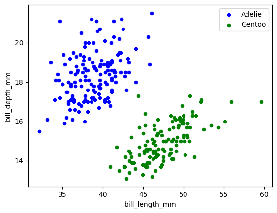
(
    df1.hvplot.scatter('bill_length_mm', 'bill_depth_mm', color="blue", label="Adelie")
    * df2.hvplot.scatter('bill_length_mm', 'bill_depth_mm', color="green", label="Gentoo")
)
dft = pd.DataFrame(np.random.randn(1000, 4), columns=list("ABCD")).cumsum()
dft.plot.line(subplots=True, layout=(2, 3), figsize=(8, 6));
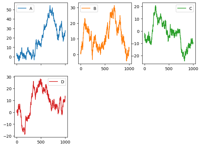
dft.hvplot.line(subplots=True, width=220).cols(3)
dft['A'].hvplot.line(width=220) + dft['B'].hvplot.line(width=220)
Plot dimensions#
Setting plot dimensions in Pandas is done with the figsize argument that accepts a tuple (width, height) in inches. figsize is not supported in hvPlot, instead, plot dimensions are set with the width (default is 700) and height (default is 700) arguments that accept integer values in pixels.
df.plot.scatter('bill_length_mm', 'bill_depth_mm', figsize=(4, 3));
df.hvplot.scatter('bill_length_mm', 'bill_depth_mm', width=350, height=250)
Default color cycle and colormap#
Pandas and hvPlot have different default color cycle and colormap.
The default color cycle in Pandas is Matplotlib’s tab10 (or “Tableau 10”) 10-colors sequence. hvPlot’s default color cycle is inherited from HoloViews and is a custom 12-colors sequence.
dfl = pd.DataFrame({col: [0, i+1] for i, col in enumerate('ABCDEFGHIJLKMN')})
dfl.plot();
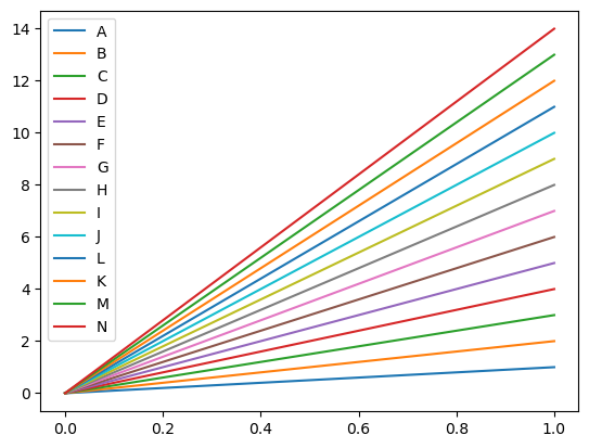
dfl.hvplot().opts(legend_cols=2)
Note
hvPlot’s default color cycle can be set via HoloViews API, make sure to run this before importing the plotting extension (e.g. hv.extension('bokeh'), done implicitly when running import hvplot.pandas).
import holoviews as hv
import matplotlib

hv.Cycle.default_cycles['default_colors'] = list(map(matplotlib.colors.rgb2hex, matplotlib.colormaps['tab10'].colors))

import hvplot.pandas

...
The default categorical colormap in Pandas is a gray scale. In hvPlot, it is glasbey_category10, a colormap with 256 colors that extends Bokeh’s Category10 colormap (originally from D3).
categories = list('ABCDEFGHIJLKMNOPQRST')
dfc = pd.DataFrame({
    'x': np.random.rand(len(categories)),
    'y': np.random.rand(len(categories)),
    'category': categories,
})
dfc['category'] = dfc['category'].astype('category')
dfc.plot.scatter('x', 'y', c='category');
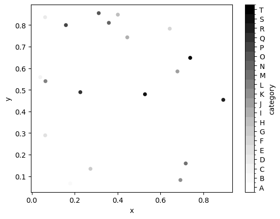
dfc.hvplot.scatter(
    'x', 'y', c='category', legend='top_right'
).opts(legend_cols=3)
The default colormap for numerical values is viridis in Pandas and kbc_r (cyan to very dark blue) in hvPlot (see more info in this issue).
df.plot.scatter('bill_length_mm', 'flipper_length_mm', c=df['body_mass_g']);
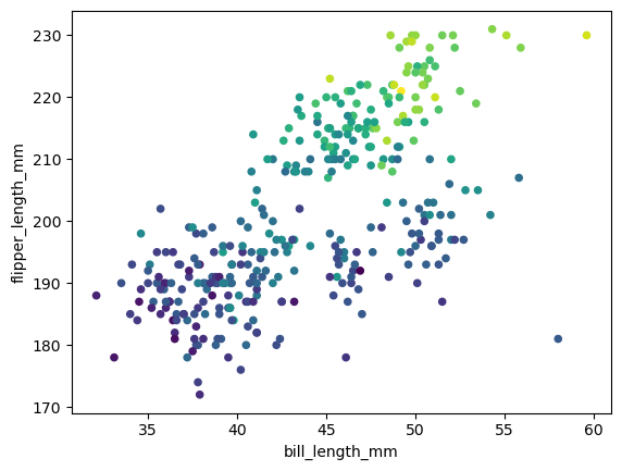
df.hvplot.scatter('bill_length_mm', 'flipper_length_mm', c=df['body_mass_g'])
Note
hvPlot does not allow yet to configure globally the default colormap. The colormap (or cmap) argument can be used instead locally.
df.hvplot.scatter('bill_length_mm', 'flipper_length_mm', c=df['body_mass_g'], cmap='viridis')
Marker size#
The marker size in hvplot.hvPlot.scatter() and hvplot.hvPlot.points() plots can be controlled with the s argument. When converting a plot from Pandas to hvPlot, the size has to be increased to obtain an output visually similar.
df.plot.scatter('bill_length_mm', 'bill_depth_mm', s=50, figsize=(4, 4));
df.hvplot.scatter('bill_length_mm', 'bill_depth_mm', s=110, aspect=1)