Comparison with Pandas API#
This page recreates the pandas chart visualization guide. It shows how to configure and control the output of pd.DataFrame.plot and pd.Series.plot to generate hvPlot plots. For comparison, the page includes both the Pandas & Matplotlib and Pandas & hvPlot plot versions.
Note
You will find many notes in this page that are used to highlight differences between Pandas and hvPlot.
Tip
We generally recommend using hvPlot by installing the hvplot namespace on Pandas objects with import hvplot.pandas.
import numpy as np
import pandas as pd

pd.options.plotting.backend = 'hvplot'
Basic Plotting: plot#
The plot method on Series and DataFrame is just a simple wrapper around hvPlot():
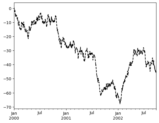
ts = pd.Series(np.random.randn(1000), index=pd.date_range('1/1/2000', periods=1000))
ts = ts.cumsum()
ts.plot(backend='matplotlib');
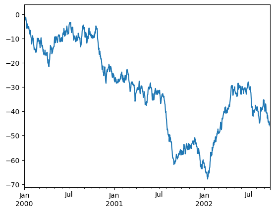
ts.plot()
If the index consists of dates, they will be formatted nicely along the x-axis as per above.
Note
Dates will be sorted as long as sort_date=True.
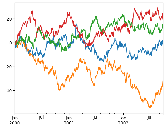
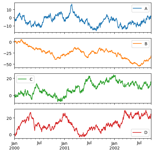
On DataFrame, plot() is a convenience to plot all of the columns with labels:
df = pd.DataFrame(np.random.randn(1000, 4), index=ts.index, columns=list('ABCD'))
df = df.cumsum()
df.plot(backend='matplotlib');
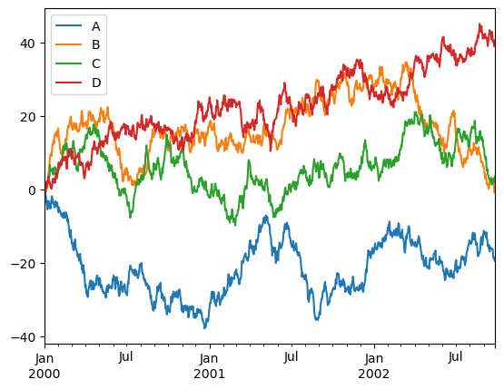
df.plot()
Note
The default colors used in hvPlot are different from pandas but you can pass your preferred colors as a list via the color keyword.
df.plot(color=['#1F77B4', '#FF7F0D', '#B5DDB5', '#D93A3B'])
You can plot one column versus another using the x and y keywords in plot():
df3 = pd.DataFrame(np.random.randn(1000, 2), columns=['B', 'C']).cumsum()
df3['A'] = pd.Series(list(range(len(df))))
df3.plot(x='A', y='B', backend='matplotlib');
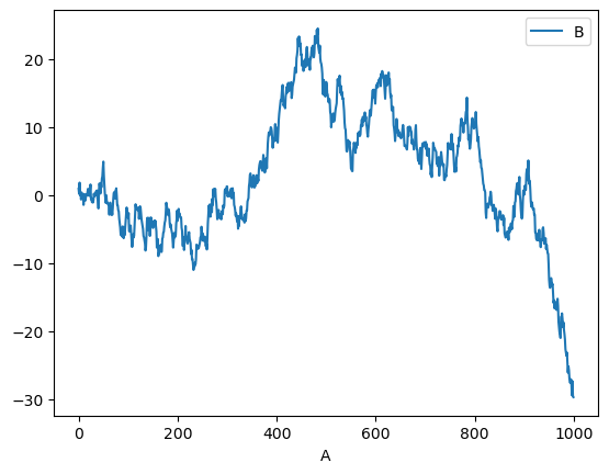
df3.plot(x='A', y='B')
Other Plots#
Plotting methods allow for a handful of plot styles other than the default line plot. These methods can be provided as the kind keyword argument to plot(). These include:
barorbarhfor bar plotshistfor histogramboxfor boxplotkdeordensityfor density plotsareafor area plotsscatterfor scatter plotshexbinfor hexagonal bin plots[NOT IMPLEMENTED]:
‘pie’for pie plots
For example, a bar plot can be created the following way:
df.iloc[5].plot(kind='bar', backend='matplotlib');
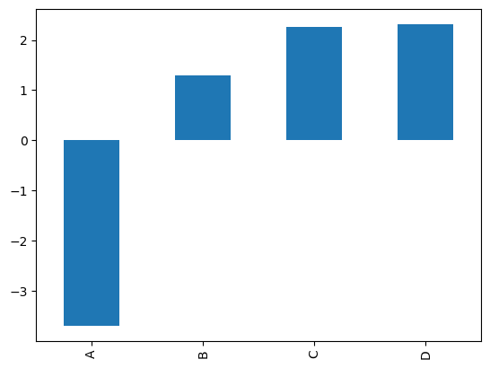
df.iloc[5].plot(kind='bar')
You can also create these other plots using the methods DataFrame.plot.<kind> instead of providing the kind keyword argument. This makes it easier to discover plot methods and the specific arguments they use.
In addition to these kinds, there are the DataFrame.hist(), and DataFrame.boxplot() methods, which use a separate interface.
Finally, there are several plotting functions in hvplot.plotting that take a Series or DataFrame as an argument. These include:
Scatter MatrixAndrews CurvesParallel CoordinatesLag Plot
Note
The following plots are not currently supported in hvPlot:
Autocorrelation PlotBootstrap PlotRadViz
Plots may also be adorned with errorbars or tables.
Bar plots#
For labeled, non-time series data, you may wish to produce a bar plot:
df.iloc[5].plot.bar(backend='matplotlib');
df.iloc[5].plot.bar()
Calling a DataFrame’s plot.bar() method produces a multiple bar plot:
df2 = pd.DataFrame(np.random.rand(10, 4), columns=['a', 'b', 'c', 'd'])
df2.plot.bar(backend='matplotlib');
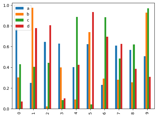
df2.plot.bar()
To produce a stacked bar plot, pass stacked=True:
df2.plot.bar(stacked=True, backend='matplotlib');
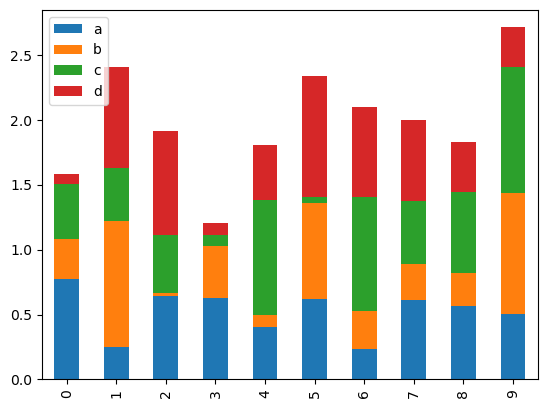
df2.plot.bar(stacked=True)
To get horizontal bar plots, use the barh method:
df2.plot.barh(stacked=True, backend='matplotlib');
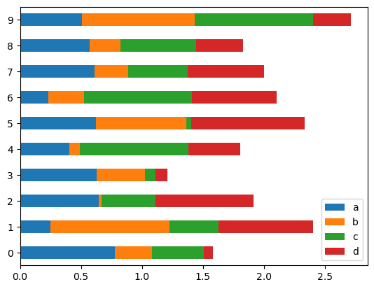
df2.plot.barh(stacked=True)
Histograms#
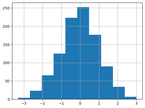
Histogram can be drawn by using the DataFrame.plot.hist() and Series.plot.hist() methods.
df4 = pd.DataFrame({'a': np.random.randn(1000) + 1, 'b': np.random.randn(1000),
                    'c': np.random.randn(1000) - 1}, columns=['a', 'b', 'c'])

df4.plot.hist(alpha=0.5, backend='matplotlib');
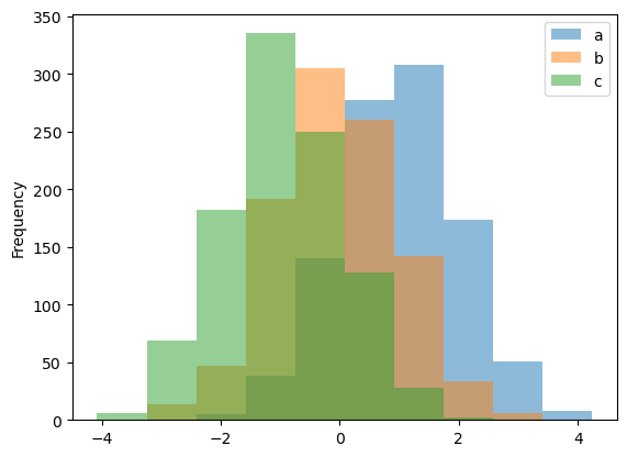
df4.plot.hist(alpha=0.5)
Note
Stacking for histograms is not yet supported in hvPlot
# df4.plot.hist(stacked=True, bins=20);
You can pass other keywords. For example, horizontal and cumulative histogram can be drawn by invert=True and cumulative=True.
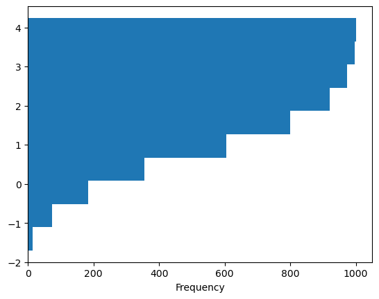
df4['a'].plot.hist(orientation='horizontal', cumulative=True, backend='matplotlib');
Note
hvPlot uses invert=True instead of orientation='horizontal'.
df4['a'].plot.hist(invert=True, cumulative=True)
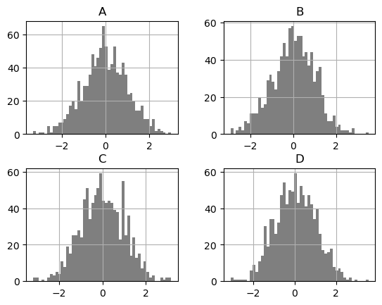
The existing interface DataFrame.hist to plot histogram still can be used.
df['A'].diff().hist(backend='matplotlib');
df['A'].diff().hist()
Note
Pandas’ DataFrame.hist() plots the histograms of the columns on multiple subplots. hvPlot creates instead an overlay of histogram plots. To reproduce Pandas’ behavior, you can set subplots=True to create a layout of plots (1 per column in this case), and additionally call .cols(2) on the object returned to lay the plots in a layout with a maximum number of 2 columns.
df.diff().hist(color='k', alpha=0.5, bins=50, backend='matplotlib');
df.diff().hist(color='k', alpha=0.5, bins=50, subplots=True, width=300).cols(2)
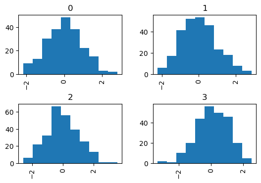
The by keyword can be specified to plot grouped histograms:
data = pd.Series(np.random.randn(1000))
df5 = pd.DataFrame({'data': data, 'by_column': np.random.randint(0, 4, 1000)})

data.hist(by=np.random.randint(0, 4, 1000), figsize=(6, 4), backend='matplotlib');
Note
Pandas’ hist method accepts a Numpy NdArray for by but hvPlot does not, which is why in the example above an extra column 'by_column' was created.
df5.hist(by='by_column', width=300, subplots=True).cols(2)
In Pandas, the by keyword can also be specified in DataFrame.plot.hist().
data = pd.DataFrame(
    {
        "a": np.random.choice(["x", "y", "z"], 1000),
        "b": np.random.choice(["e", "f", "g"], 1000),
        "c": np.random.randn(1000),
        "d": np.random.randn(1000) - 1,
    },
)
data.plot.hist(by=["a", "b"], figsize=(10, 5), backend='matplotlib');
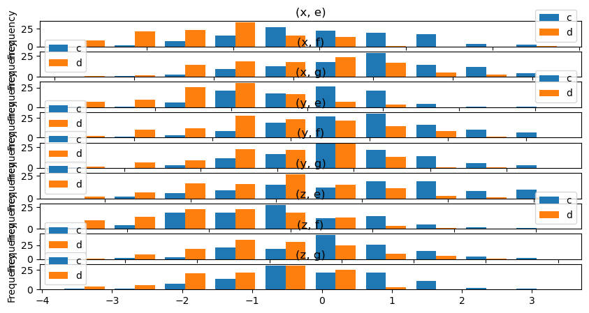
Note
This is not yet supported in hvPlot but a similar plot can be generated using HoloViews directly.
import holoviews as hv
from holoviews.operation import histogram

ds = hv.Dataset(data, kdims=['a', 'b'], vdims=['c', 'd'])
dsg = ds.groupby(['a', 'b'])
(
    hv.NdLayout(histogram(dsg, dimension='c'))
    * hv.NdLayout(histogram(dsg, dimension='d'))
).opts(
    hv.opts.Histogram(height=100, width=800)
).cols(1)
Box Plots#
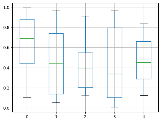
Boxplot can be drawn by calling Series.plot.box() and DataFrame.plot.box(), or DataFrame.boxplot() to visualize the distribution of values within each column.
For instance, here is a boxplot representing five trials of 10 observations of a uniform random variable on [0,1).
df = pd.DataFrame(np.random.rand(10, 5), columns=['A', 'B', 'C', 'D', 'E'])
df.plot.box(backend='matplotlib');
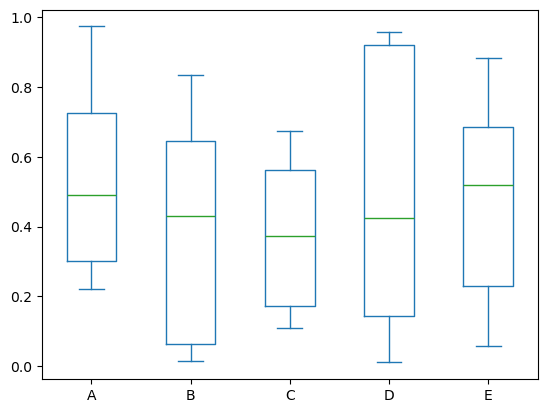
df.plot.box()
Using the matplotlib backend, boxplot can be colorized by passing color keyword. You can pass a dict whose keys are boxes, whiskers, medians and caps. If some keys are missing in the dict, default colors are used for the corresponding artists. Also, boxplot has sym keyword to specify fliers style.
color = {
    "boxes": "DarkGreen",
    "whiskers": "DarkOrange",
    "medians": "DarkBlue",
    "caps": "Gray",
}

df.plot.box(color=color, sym='r+', backend='matplotlib');
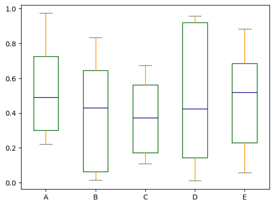
Note
Setting color this way or sym isn’t supported in hvPlot. However hvPlot supports passing down backend-specific style options that allow some level of customization.
df.plot.box(
    box_fill_color='white',
    box_line_color='DarkGreen',
    whisker_line_color='DarkOrange',
    outlier_color='red',
)
In Pandas, you can pass other keywords supported by matplotlib boxplot. For example, horizontal and custom-positioned boxplot can be drawn by vert=False and positions keywords.
df.plot.box(vert=False, positions=[1, 4, 5, 6, 8], backend='matplotlib');
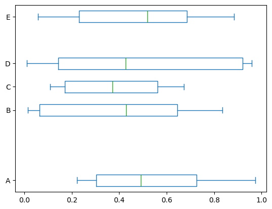
Note
vert and positions are not supported by hvPlot and the Bokeh extension. Instead, and for example, horizontal boxplots can be drawn by invert=True.
df.plot.box(invert=True)
The existing interface DataFrame.boxplot to plot boxplot still can be used.
df = pd.DataFrame(np.random.rand(10, 5))
df.boxplot(backend='matplotlib')
<Axes: >
df.boxplot()
In Pandas, you can create a stratified boxplot using the by keyword argument to create groupings.
df = pd.DataFrame(np.random.rand(10,2), columns=['Col1', 'Col2'])
df['X'] = pd.Series(['A','A','A','A','A','B','B','B','B','B'])
df.boxplot(by='X', backend='matplotlib');
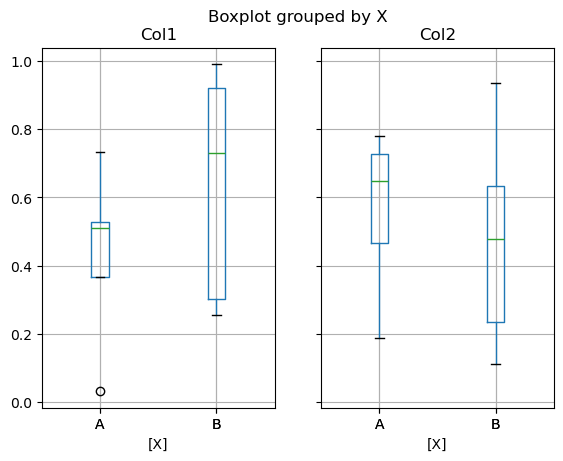
Note
In hvPlot this plot can be generated differently by transforming first the data to long format with Pandas and then using by and col to facet the plot.
df_melted = df.melt(id_vars=['X'], value_vars=['Col1', 'Col2'], var_name='Col')
df_melted.boxplot(col='Col', by='X')
You can also pass a subset of columns to plot, as well as group by multiple columns:
df = pd.DataFrame(np.random.rand(10,3), columns=['Col1', 'Col2', 'Col3'])

df['X'] = pd.Series(['A','A','A','A','A','B','B','B','B','B'])
df['Y'] = pd.Series(['A','B','A','B','A','B','A','B','A','B'])

bp = df.boxplot(column=["Col1", "Col2"], by=["X", "Y"], backend='matplotlib')
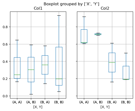
Note
In hvPlot this plot can be generated differently by transforming first the data to long format with Pandas and then using by and col to facet the plot.
df_melted = df.melt(id_vars=['X', 'Y'], value_vars=['Col1', 'Col2'], var_name='Col')
df_melted.boxplot(col='Col', by=['X', 'Y'])
df_box = pd.DataFrame(np.random.randn(50, 2))
df_box['g'] = np.random.choice(['A', 'B'], size=50)
df_box.loc[df_box['g'] == 'B', 1] += 3
df_box.boxplot(row='g')
For more control over the ordering of the levels, we can perform a groupby on the data before plotting.
df_box.groupby('g').boxplot()
Area Plot#
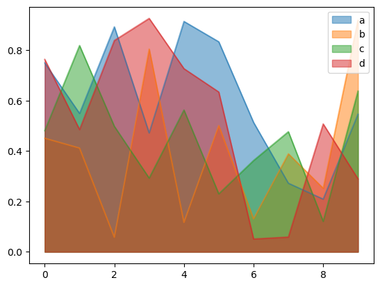
You can create area plots with Series.plot.area() and DataFrame.plot.area(). Area plots are stacked by default. To produce stacked area plot, each column must be either all positive or all negative values.
When input data contains NaN, it will be automatically filled by 0. If you want to drop or fill by different values, use dataframe.dropna() or dataframe.fillna() before calling plot.
df = pd.DataFrame(np.random.rand(10, 4), columns=['a', 'b', 'c', 'd'])
df.plot.area(backend='matplotlib');
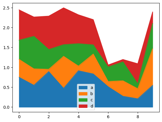
df.plot.area()
To produce an unstacked plot, pass stacked=False. In Pandas, alpha value is set to 0.5 unless otherwise specified:
df.plot.area(stacked=False, backend='matplotlib');
df.plot.area(stacked=False, alpha=0.5)
Scatter Plot#
Scatter plots can be drawn by using the DataFrame.plot.scatter() method. Scatter plots require that x and y be specified using the x and y keywords.
df = pd.DataFrame(np.random.rand(50, 4), columns=['a', 'b', 'c', 'd'])
df["species"] = pd.Categorical(

    ["setosa"] * 20 + ["versicolor"] * 20 + ["virginica"] * 10

)
df.plot.scatter(x='a', y='b', backend='matplotlib');
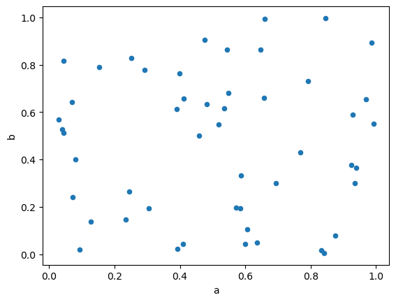
df.plot.scatter(x='a', y='b')
In Pandas, to plot multiple column groups in a single axes, repeat plot method specifying target ax. It is recommended to specify color and label keywords to distinguish each groups.
Note
In hvPlot, to plot multiple column groups in a single axes, repeat plot method and then use the overlay operator (*) to combine the plots.
ax = df.plot.scatter(x="a", y="b", color="DarkBlue", label="Group 1", backend='matplotlib')
df.plot.scatter(x="c", y="d", color="DarkGreen", label="Group 2", ax=ax, backend='matplotlib');
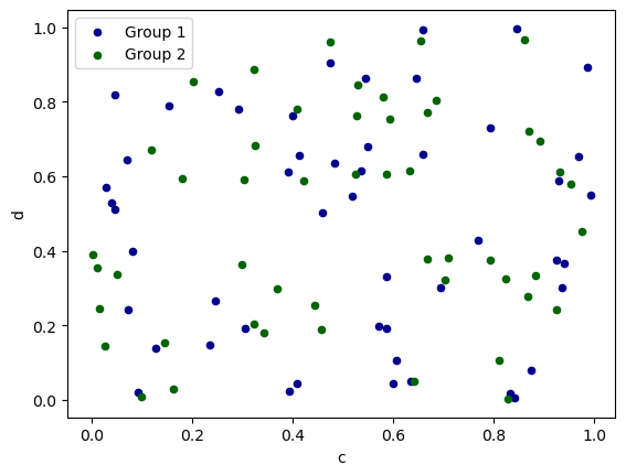
plot_1 = df.plot.scatter(x='a', y='b', color='DarkBlue', label='Group 1')
plot_2 = df.plot.scatter(x='c', y='d', color='DarkGreen', label='Group 2')
plot_1 * plot_2
The keyword c may be given as the name of a column to provide colors for each point:
df.plot.scatter(x='a', y='b', c='c', s=50, backend='matplotlib');
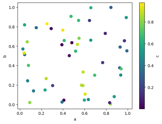
df.plot.scatter(x='a', y='b', c='c', s=50)
Note
The default colors for continuous labelling in hvPlot is the kbc_r cmap. You can change the colormap to the pandas default by using the cmap keyword.
df.plot.scatter(x='a', y='b', c='c', s=50, cmap='viridis')
If a categorical column is passed to c, then, in Pandas, a discrete colorbar will be produced:
df.plot.scatter(x="a", y="b", c="species", s=50, cmap="viridis", backend='matplotlib');
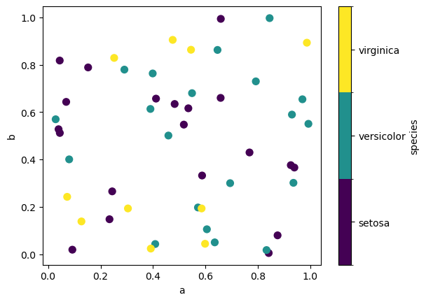
Note
In hvPlot, setting c does not display a colorbar but a legend. The default categorical colormap used is glasbey_category10.
df.plot.scatter(x="a", y="b", c="species", s=50)
You can pass other keywords supported by matplotlib scatter. The example below shows a bubble chart using a column of the DataFrame as the bubble size.
df.plot.scatter(x="a", y="b", s=df["c"] * 200, backend='matplotlib');
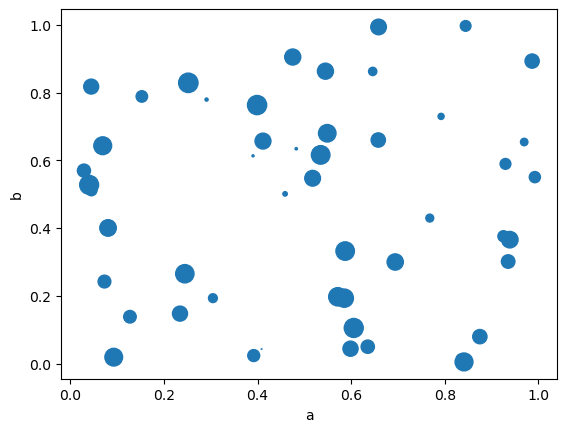
Note
In hvPlot you may need to increase s to obtain markers with a size similar to the ones generated with Pandas and Matplotlib.
df.plot.scatter(x='a', y='b', s=df['c'] * 500)
Note
In hvPlot, the same effect can be accomplished using the scale option.
df.plot.scatter(x='a', y='b', s='c', scale=25)
Hexagonal Bin Plot#
You can create hexagonal bin plots with DataFrame.plot.hexbin(). Hexbin plots can be a useful alternative to scatter plots if your data are too dense to plot each point individually.
df = pd.DataFrame(np.random.randn(1000, 2), columns=['a', 'b'])
df['b'] = df['b'] + np.arange(1000)
df.plot.hexbin(x="a", y="b", gridsize=25, backend='matplotlib');
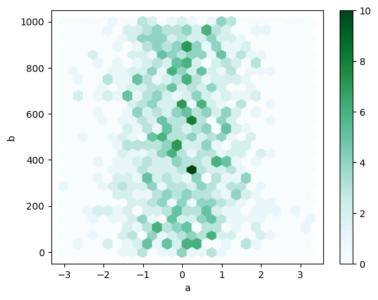
Note
We pass aspect=1 to hvPlot to generate a plot with dimensions similar to the one generated with Pandas and Matplotlib
df.plot.hexbin(x='a', y='b', gridsize=25, aspect=1)
A useful keyword argument is gridsize; it controls the number of hexagons in the x-direction, and defaults to 100. A larger gridsize means more, smaller bins.
By default, a histogram of the counts around each (x, y) point is computed. You can specify alternative aggregations by passing values to the C and reduce_C_function arguments. C specifies the value at each (x, y) point and reduce_C_function is a function of one argument that reduces all the values in a bin to a single number (e.g. mean, max, sum, std). In this example the positions are given by columns a and b, while the value is given by column z. The bins are aggregated with Numpy’s max function.
df = pd.DataFrame(np.random.randn(1000, 2), columns=['a', 'b'])
df['b'] = df['b'] + np.arange(1000)
df['z'] = np.random.uniform(0, 3, 1000)
df.plot.hexbin(x='a', y='b', C='z', reduce_C_function=np.max, gridsize=25, backend='matplotlib');
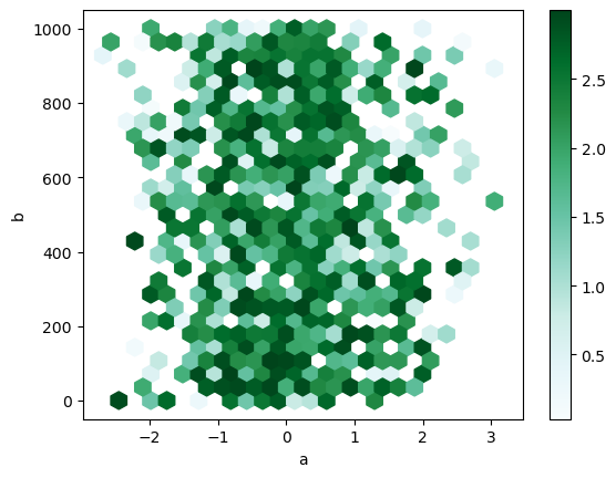
Note
In hvPlot, reduce_function is used instead of reduce_C_function.
df.plot.hexbin(x='a', y='b', C='z', reduce_function=np.max, gridsize=25, aspect=1)
Pie plot#
Note
Not yet implemented in hvPlot/HoloViews.
Density Plot#
You can create density plots using the Series.plot.kde() and DataFrame.plot.kde() methods.
ser = pd.Series(np.random.randn(1000))
ser.plot.kde(backend='matplotlib');
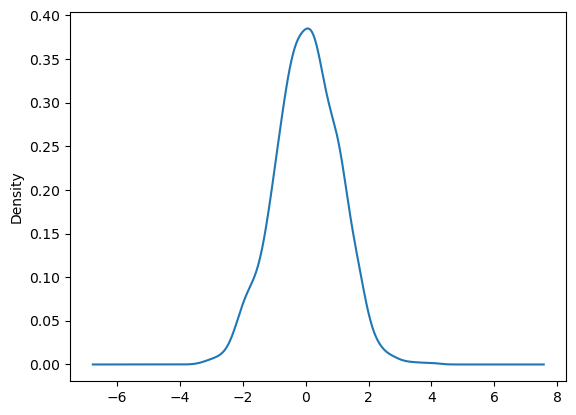
ser.plot.kde()
Plotting with missing data#
hvPlot tries to be pragmatic about plotting DataFrames or Series that contain missing data. Missing values are dropped, left out, or filled depending on the plot type.
(To be confirmed)
Plot Type |
Nan Handling |
|---|---|
Line |
Leave gaps at NaNs |
Line (stacked) |
Fill 0’s |
Bar |
Fill 0’s |
Scatter |
Drop NaNs |
Histogram |
Drop NaNs (column-wise) |
Box |
Drop NaNs (column-wise) |
Area |
Fill 0’s |
KDE |
Drop NaNs (column-wise) |
Hexbin |
Fill 0’s |
Pie |
Not supported |
Plotting Tools#
These functions can be imported from hvplot.plotting and take a Series or DataFrame as an argument.
Scatter Matrix Plot#
You can create a scatter plot matrix using the scatter_matrix function:
from pandas.plotting import scatter_matrix as pd_scatter_matrix

df = pd.DataFrame(np.random.randn(1000, 4), columns=['a', 'b', 'c', 'd'])
pd_scatter_matrix(df, alpha=0.2, figsize=(6, 6), diagonal='kde');
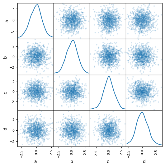
from hvplot import scatter_matrix

scatter_matrix(df, alpha=0.2, diagonal='kde')
Note
In hvPlot, since scatter matrix plots may generate a large number of points (the one above renders 120,000 points!), you may want to take advantage of the power provided by Datashader to rasterize the off-diagonal plots into a fixed-resolution representation.
df = pd.DataFrame(np.random.randn(10000, 4), columns=['a', 'b', 'c', 'd'])

scatter_matrix(df, rasterize=True, dynspread=True)
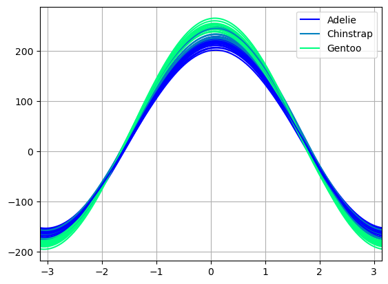
Andrews Curves#
Andrews curves allow one to plot multivariate data as a large number of curves that are created using the attributes of samples as coefficients for Fourier series, see the Wikipedia entry for more information. By coloring these curves differently for each class it is possible to visualize data clustering. Curves belonging to samples of the same class will usually be closer together and form larger structures.
import hvsampledata

dfp = hvsampledata.penguins("pandas")
df_data = dfp[['bill_length_mm', 'bill_depth_mm', 'flipper_length_mm', 'body_mass_g']].sample(frac=0.3)
df_data = (df_data - df_data.min()) / (df_data.max() - df_data.min())
df_data['species'] = dfp['species']
from pandas.plotting import andrews_curves

andrews_curves(df_data, 'species');
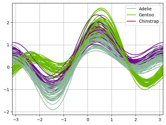
from hvplot.plotting import andrews_curves

andrews_curves(df_data, 'species')
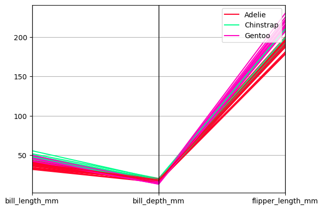
Parallel Coordinates#
Parallel coordinates is a plotting technique for plotting multivariate data, see the Wikipedia entry for an introduction. Parallel coordinates allows one to see clusters in data and to estimate other statistics visually. Using parallel coordinates points are represented as connected line segments. Each vertical line represents one attribute. One set of connected line segments represents one data point. Points that tend to cluster will appear closer together.
from pandas.plotting import parallel_coordinates

parallel_coordinates(df_data, 'species');
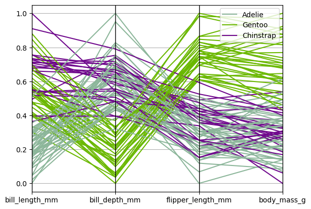
from hvplot.plotting import parallel_coordinates

parallel_coordinates(df_data, 'species')
Lag Plot#
Lag plots are used to check if a data set or time series is random. Random data should not exhibit any structure in the lag plot. Non-random structure implies that the underlying data are not random. The lag argument may be passed, and when lag=1 the plot is essentially data[:-1] vs. data[1:].
from pandas.plotting import lag_plot

spacing = np.linspace(-99 * np.pi, 99 * np.pi, num=1000)
data = pd.Series(0.1 * np.random.rand(1000) + 0.9 * np.sin(spacing))

lag_plot(data);
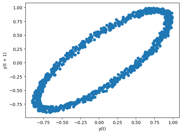
from hvplot.plotting import lag_plot

lag_plot(data)
Autocorrelation plot#
Note
Not yet implemented in hvPlot.
Bootstrap plot#
Note
Not yet implemented in hvPlot.
RadViz#
Note
Not yet implemented in hvPlot.
Plot Formatting#
Setting the plot style#
TBD
General plot style arguments#
Most plotting methods have a set of keyword arguments that control the layout and formatting of the returned plot:
ts.plot(style='k--', label='Series', backend='matplotlib');
Note
The style keyword to customize line plots isn’t supported in hvPlot. Instead, hvPlot offers some generic styling options like c (alias for color), and backend-specific styling options like line_dash.
ts.plot(c='k', line_dash='dashed', label='Series')
For each kind of plot (e.g. line, bar, scatter) any additional arguments keywords are passed along to the corresponding HoloViews object (hv.Curve, hv.Bar, hv.Scatter). These can be used to control additional styling, beyond what hvPlot provides.
Controlling the legend#
You may set the legend argument to False to hide the legend, which is shown by default.
df = pd.DataFrame(np.random.randn(1000, 4), index=ts.index, columns=list("ABCD"))
df = df.cumsum()

df.plot(legend=False, backend='matplotlib');
df.plot(legend=False)
Note
In hvPlot, you can also control the placement of the legend using the same legend argument set to one of: 'top_right', 'top_left', 'bottom_left', 'bottom_right', 'right', 'left', 'top', or 'bottom'.
df.plot(legend='top_left')
Controlling the labels#
You may set the xlabel and ylabel arguments to give the plot custom labels for x and y axis. By default, pandas will pick up index name as xlabel, while leaving it empty for ylabel.
df.plot(xlabel="new x", ylabel="new y", backend='matplotlib');
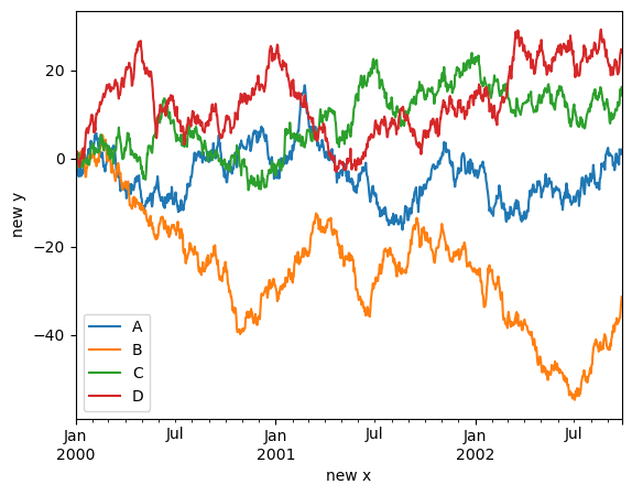
df.plot(xlabel="new x", ylabel="new y")
Scales#
You may pass logy to get a log-scale Y axis.
ts = pd.Series(np.random.randn(1000), index=pd.date_range("1/1/2000", periods=1000))
ts = np.exp(ts.cumsum())
ts.plot(logy=True, backend='matplotlib');
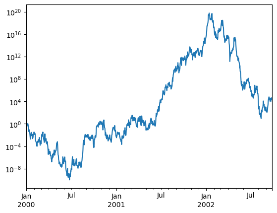
ts.plot(logy=True)
See also the logx and loglog keyword arguments.
Note
In hvPlot, logz=True allows to get a log-scale on the color axis.
dfh = pd.DataFrame(np.random.randn(1000, 2), columns=['a', 'b'])
dfh['b'] = dfh['b'] + np.arange(1000)
dfh.plot.hexbin(x='a', y='b', gridsize=25, width=500, height=400, logz=True)
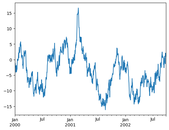
Plotting on a Secondary Y-axis#
In Pandas, to plot data on a secondary y-axis, use the secondary_y keyword:
df["A"].plot(backend='matplotlib')
df["B"].plot(secondary_y=True, style="g", backend='matplotlib');
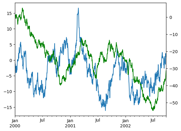
Note
hvPlot does not currently have built-in support for multiple y-axes, but you can achieve this effect by overlaying multiple plots and setting the multi_y option in .opts(). This allows each y-variable to be displayed on a separate axis.
(df.plot(y='A') * df.plot(y='B') * df.plot(y='C')).opts(multi_y=True)
Suppressing tick resolution adjustment#
pandas includes automatic tick resolution adjustment for regular frequency time-series data. For limited cases where pandas cannot infer the frequency information (e.g., in an externally created twinx), you can choose to suppress this behavior for alignment purposes.
Here is the default behavior, notice how the x-axis tick labeling is performed:
df['A'].plot(backend='matplotlib');
df['A'].plot()
Using the x_compat parameter, you can suppress this behavior:
df["A"].plot(x_compat=True, backend='matplotlib');
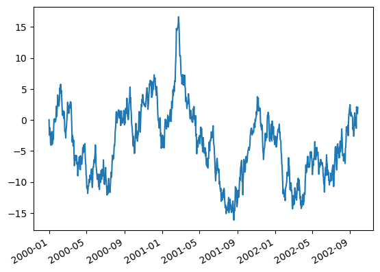
Note
In hvPlot, formatters can be set using format strings, by declaring bokeh TickFormatters, or using custom functions. See HoloViews Tick Docs for more information.
from bokeh.models.formatters import DatetimeTickFormatter

formatter = DatetimeTickFormatter(months='%b %Y')
df['A'].plot(yformatter='$%.2f', xformatter=formatter)
Subplots#
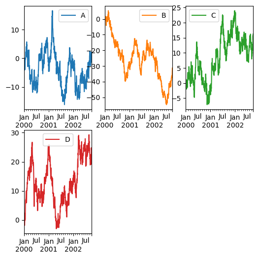
Each Series in a DataFrame can be plotted on a different axis with the subplots keyword.
df.plot(subplots=True, figsize=(6, 6), backend='matplotlib');
Note
In hvPlot, you can control the maximum number N of plots displayed on a row by calling .cols(N) on the HoloViews layout returned by the .plot() call.
df.plot(subplots=True, height=120).cols(1)
Controlling layout and targeting multiple axes#
In Pandas, the layout of subplots can be specified by the layout keyword. It can accept (rows, columns). The layout keyword can be used in hist and boxplot also. If the input is invalid, a ValueError will be raised.
df.plot(subplots=True, layout=(2, 3), figsize=(6, 6), sharex=False, backend='matplotlib');
Note
In hvPlot, layout is not supported, use .cols(N) instead.
df.plot(subplots=True, sharex=False, width=160).cols(3)
Note
In hvPlot, setting sharex and/or sharey to True is equivalent to setting shared_axes=True.
Plotting with error bars#
In Pandas, plotting with error bars is supported in DataFrame.plot() and Series.plot(). Horizontal and vertical error bars can be supplied to the xerr and yerr keyword arguments to plot().
df3 = pd.DataFrame({'data1': [3, 2, 4, 3, 2, 4, 3, 2],
                    'data2': [6, 5, 7, 5, 4, 5, 6, 5]})
mean_std = pd.DataFrame({'mean': df3.mean(), 'std': df3.std()})
mean_std.plot.bar(y='mean', yerr='std', capsize=4, rot=0, backend='matplotlib');

Note
In hvPlot, plotting with error bars is not directly supported in DataFrame.plot() and Series.plot(). Instead, users should fall back to using the hvplot namespace directly and the errorbars() plotting method it offers.
import hvplot.pandas  # noqa

(
    mean_std.plot.bar(y='mean', alpha=0.7)
    * mean_std.hvplot.errorbars(x='index', y='mean', yerr1='std')
)
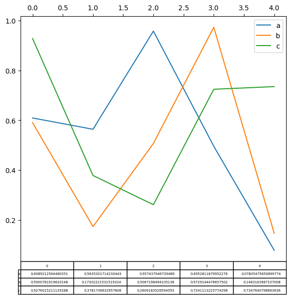
Plotting tables#
In Pandas, plotting with matplotlib table is now supported in DataFrame.plot() and Series.plot() with a table keyword. The table keyword can accept bool, DataFrame or Series. The simple way to draw a table is to specify table=True. Data will be transposed to meet matplotlib’s default layout.
import matplotlib.pyplot as plt

fig, ax = plt.subplots(1, 1, figsize=(7, 6.5))
df = pd.DataFrame(np.random.rand(5, 3), columns=["a", "b", "c"])
ax.xaxis.tick_top()  # Display x-axis ticks on top.
df.plot(table=True, ax=ax, backend='matplotlib');
Note
In hvPlot, this same effect can be accomplished by using hvplot.table() and creating a layout of the resulting plots with the + operator, arranged with .cols(1).
import hvplot.pandas  # noqa

(
    df.plot(xaxis=False, legend='top_right')
    + df.T.hvplot.table()
).cols(1)
See also
See Panel’s Tabulator widget for a more powerful table component.
Colormaps#
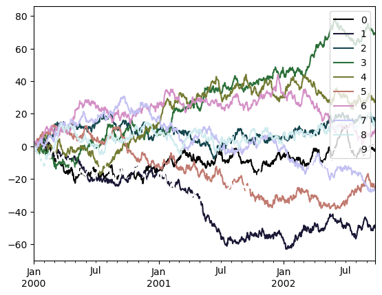
A potential issue when plotting a large number of columns is that it can be difficult to distinguish some series due to repetition in the default colors. To remedy this, DataFrame plotting supports the use of the colormap argument, which accepts either a colormap or a string that is a name of a colormap.
To use the cubehelix colormap, we can pass colormap='cubehelix'.
df = pd.DataFrame(np.random.randn(1000, 10), index=ts.index)
df = df.cumsum()
df.plot(colormap='cubehelix', backend='matplotlib');
Note
colormap is not yet supported in hvPlot for line plots. However, in this case color can be used instead when set to a HoloViews Palette object, that can sample a given colormap at a regularly spaced interval (in this case, the number of overlaid lines).
import matplotlib
import holoviews as hv

# cubehelix palette only added when the matplotlib extension is loaded
hv.Palette.colormaps['cubehelix'] = matplotlib.colormaps['cubehelix']

df.plot(color=hv.Palette("cubehelix"))
Colormaps can also be used with other plot types, like bar charts:
dd = pd.DataFrame(np.random.randn(10, 10)).map(abs)
dd = dd.cumsum()
dd.plot.bar(colormap='Greens', backend='matplotlib');
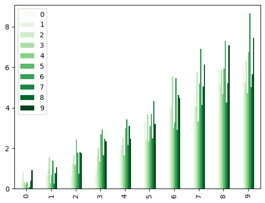
dd.plot.bar(colormap='Greens')
Parallel coordinates charts:
import hvsampledata
from pandas.plotting import parallel_coordinates

dfp = hvsampledata.penguins('pandas')[['species', 'bill_length_mm', 'bill_depth_mm', 'flipper_length_mm']].sample(n=50)

parallel_coordinates(dfp, 'species', colormap='gist_rainbow');
from hvplot import parallel_coordinates

parallel_coordinates(dfp, 'species', colormap='gist_rainbow')
Andrews curves charts:
from pandas.plotting import andrews_curves

andrews_curves(dfp, 'species', colormap='winter')
<Axes: >
from hvplot.plotting import andrews_curves

andrews_curves(dfp, 'species', colormap='winter')
Plotting directly with HoloViews#
In some situations it may still be preferable or necessary to prepare plots directly with hvPlot or HoloViews, for instance when a certain type of plot or customization is not (yet) supported by pandas. Series and DataFrame objects behave like arrays and can therefore be passed directly to HoloViews functions without explicit casts.
import holoviews as hv

price = pd.Series(np.random.randn(150).cumsum(),
                  index=pd.date_range('2000-1-1', periods=150, freq='B'), name='price')
ma = price.rolling(20).mean()
mstd = price.rolling(20).std()

price.plot(c='k') * ma.plot(c='b', label='mean') * \
hv.Area((mstd.index, ma - 2 * mstd, ma + 2 * mstd),
        vdims=['y', 'y2']).opts(color='b', alpha=0.2)